Responsive Web Design: Complete Guide, Benefits and Best Practices
Responsive Web Design: Why It Matters
People access websites through many types of devices, including desktop computers, laptops, tablets, smartphones, televisions, foldable devices, and screens with different dimensions or input methods.
A website should remain readable, functional, and easy to navigate regardless of the device being used. Visitors should not have to zoom repeatedly, scroll horizontally, struggle with tiny buttons, or wait for unnecessarily large media files to load.
Responsive web design helps a website adapt its layout and content presentation to the available viewing space. It supports a more consistent experience while allowing a business to maintain one primary website instead of creating separate desktop and mobile versions.
Responsive design is not only about making a website look attractive on a smaller screen. It also affects:
- Content readability.
- Navigation and product discovery.
- Form completion.
- Page performance.
- Accessibility.
- Customer trust.
- Lead generation and ecommerce conversions.
- Website maintenance.
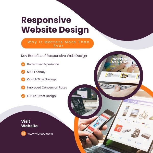
What Is Responsive Web Design?
Responsive web design is an approach in which a website’s layout, typography, images, navigation, and interface components adapt to different viewport sizes and device characteristics.
A responsive website commonly uses:
- Flexible layouts.
- Relative sizing units.
- CSS media queries.
- CSS Grid and Flexbox.
- Responsive images.
- Flexible video and embedded content.
- Content-based breakpoints.
JavaScript may enhance particular responsive interactions, but it is not a basic requirement for creating a responsive layout. The main structural behavior should generally be handled through semantic HTML and CSS.
A Simple Responsive Design Example
The following viewport declaration tells mobile browsers to use the device’s actual viewport width:
<meta name="viewport" content="width=device-width, initial-scale=1">
A simple CSS media query can change a two-column layout into one column when there is not enough horizontal space:
.content-layout {
    display: grid;
    grid-template-columns: 2fr 1fr;
    gap: 2rem;
}

@media (max-width: 48rem) {
    .content-layout {
        grid-template-columns: 1fr;
    }
}
Breakpoints should be selected according to where the content and interface begin to look crowded or difficult to use. They should not be based only on the dimensions of a few popular devices.
Responsive Design vs. Mobile-Friendly Design
The terms are related but do not always describe exactly the same thing.
- Mobile-friendly website: A website that can be used reasonably well on a mobile device.
- Responsive website: A website whose layout and components adapt fluidly to different viewing conditions.
- Mobile-first design: A design process that begins with essential content and functionality for narrow screens, then progressively enhances the experience for larger screens.
A website may technically fit on a phone while still delivering a poor mobile experience. For example, the page may contain tiny text, closely spaced links, an unusable form, or a large desktop menu compressed into a narrow screen.
Responsive Design vs. Adaptive Design
Responsive and adaptive design both aim to support different devices, but they use different approaches.
Responsive Design
Responsive layouts usually change fluidly as the available space changes. Elements can grow, shrink, wrap, or move according to the viewport and component size.
Adaptive Design
Adaptive design typically uses several predefined layouts created for particular ranges or device conditions. The website selects the most appropriate version from those available.
Responsive design is commonly preferred for general websites because it can support a wide range of screen sizes without requiring a separate layout for every device. However, responsive and adaptive techniques can also be combined when a project has specialized requirements.
Key Benefits of Responsive Web Design
1. Better User Experience
A responsive website makes it easier for visitors to read content, use navigation, complete forms, view products, and perform important actions without unnecessary resizing or scrolling.
2. Consistent Content Across Devices
Maintaining the same primary content and functionality across devices reduces the risk that mobile visitors will receive incomplete information.
Important content should not be removed merely because the screen is small. Instead, the presentation can be reorganized or secondary details can be placed in accessible expandable sections.
3. Simpler Website Management
A single responsive website is often easier to maintain than separate desktop and mobile websites.
Teams can manage:
- One main URL for each page.
- One content system.
- One analytics implementation.
- One technical SEO configuration.
- One set of redirects and canonical signals.
4. Better Support for Search Visibility
Responsive design can support technical SEO by keeping content, structured data, metadata, internal links, and primary functionality consistent across screen sizes.
However, responsive design does not guarantee higher rankings. Search performance still depends on content quality, relevance, crawlability, authority, performance, and many other factors.
5. Improved Conversion Opportunities
Visitors are more likely to complete an action when buttons, forms, product information, contact details, and checkout steps are easy to use on their device.
Responsive design can reduce interface friction, but conversion results are also affected by pricing, offers, traffic quality, brand trust, content, and customer demand.
6. Support for More Screen Sizes
A well-implemented responsive layout is not limited to several predefined phone and tablet widths. It can adapt to a continuous range of viewport dimensions.
This helps the website remain usable on new devices without requiring a complete redesign every time a new screen size appears.
Mobile-First Design Principles
A mobile-first process begins with the essential content and actions required on a narrow screen. The design is then enhanced as additional space becomes available.
Prioritize Essential Content
Identify what visitors need most on each page.
For example, a service page may prioritize:
- The service name.
- A concise value proposition.
- Main benefits.
- Price or quotation information.
- A contact action.
Secondary content can appear later on the page without being permanently hidden from mobile users.
Design for Touch Input
Touch interfaces do not provide the same precision or hover behavior as a mouse.
Buttons and links should:
- Have sufficient size and spacing.
- Provide clear pressed or selected feedback.
- Remain usable without hover.
- Avoid accidental activation of nearby controls.
Keep Primary Actions Easy to Find
Calls to action should remain visible and understandable without covering important content.
Examples include:
- Contact Us.
- Request a Quote.
- Add to Cart.
- Book an Appointment.
- Call Now.
Avoid Intrusive Mobile Overlays
Large pop-ups, advertisements, cookie banners, and chat widgets can block most of a small screen.
Overlays should be:
- Easy to close.
- Accessible by keyboard.
- Properly labeled.
- Small enough to preserve page context.
- Used only when they serve a clear purpose.
Core Responsive Web Design Techniques
1. Fluid Layouts
Fluid layouts use flexible dimensions instead of depending entirely on fixed pixel widths.
For example:
.page-container {
    width: min(100% - 2rem, 75rem);
    margin-inline: auto;
}
This allows the page to use the available width while maintaining readable margins and a reasonable maximum content width.
2. CSS Grid and Flexbox
CSS Grid is useful for two-dimensional page and component layouts, while Flexbox is effective for arranging items in a row or column.
Both technologies can reduce reliance on rigid dimensions and complicated positioning.
3. Media Queries
Media queries apply styles according to conditions such as viewport width, orientation, available height, pointer accuracy, or user preferences.
They can also respond to accessibility-related preferences such as reduced motion:
@media (prefers-reduced-motion: reduce) {
    *,
    *::before,
    *::after {
        scroll-behavior: auto;
        animation-duration: 0.01ms;
        animation-iteration-count: 1;
    }
}
4. Container Queries
Traditional media queries respond primarily to the viewport. Container queries allow a component to adapt according to the space available inside its parent container.
This is useful for reusable components that may appear in a full-width section, sidebar, card grid, or modal window.
5. Flexible Typography
Responsive typography can scale within reasonable minimum and maximum values.
For example:
h1 {
    font-size: clamp(2rem, 5vw, 4rem);
}
Text should remain readable without becoming excessively small on narrow screens or unnecessarily large on wide screens.
6. Responsive Spacing
Margins, padding, and gaps can also adapt to the available space:
.section {
    padding-block: clamp(2.5rem, 6vw, 6rem);
}
Responsive Images and Media
Large desktop images should not automatically be downloaded at their full resolution on every mobile device.
Use srcset and sizes
The browser can choose from several image candidates according to the viewport, display size, and device resolution:
<img src="product-800.jpg"
    srcset="
        product-480.jpg 480w,
        product-800.jpg 800w,
        product-1400.jpg 1400w
    "
    sizes="
        (max-width: 40rem) 100vw,
        (max-width: 70rem) 50vw,
        40rem
    "
    width="800"
    height="600"
    alt="Front view of the featured product"


>
Use the picture Element When Needed
The picture element can provide alternative crops or image formats:
<picture>
    <source
        media="(max-width: 40rem)"
        srcset="banner-mobile.webp"
    >
    <img src="banner-desktop.webp"
        width="1600"
        height="700"
        alt="Team collaborating on a responsive website"
    >
</picture>
Make Video and Embeds Flexible
Videos, maps, and embedded content should remain within their containers:
img,
video,
iframe {
    max-width: 100%;
}

img,
video {
    height: auto;
}
For embedded video, use an aspect-ratio container so the element scales without distortion.
Responsive Navigation Design
Navigation should help users understand the website structure and reach important pages efficiently.
Do Not Automatically Default to a Hamburger Menu
A hamburger menu can save space, but it also hides navigation options. Small websites may perform better with several visible primary links and a compact overflow menu.
The navigation pattern should be selected according to:
- Number of menu items.
- Importance of each destination.
- Audience familiarity.
- Available space.
- Device and input type.
Make Responsive Menus Accessible
A mobile menu should:
- Use a real button to open and close the menu.
- Expose its expanded or collapsed state to assistive technology.
- Work with keyboard input.
- Maintain visible focus.
- Allow users to close it easily.
- Avoid trapping focus incorrectly.
Keep Important Links Available
Do not remove essential navigation, account access, search, contact information, or purchasing functions simply to create a visually minimal mobile header.
Responsive Forms
Forms are often where responsive websites fail. A contact form may fit within the screen while still being difficult to complete.
Responsive Form Best Practices
- Use a single-column layout on narrow screens.
- Provide visible labels.
- Use appropriate input types.
- Allow password managers and autofill to work.
- Show errors near the affected field.
- Preserve entered values after validation errors.
- Ensure controls remain visible when the mobile keyboard opens.
- Use sufficiently large checkboxes, radio buttons, and buttons.
- Avoid asking for unnecessary information.
Placeholder text should not be used as the only form label because it disappears when the user begins typing.
Responsive Tables
Data tables can be difficult to display on narrow screens. The correct solution depends on the type of information.
Possible approaches include:
- Allowing horizontal scrolling within the table container.
- Keeping the first column visible.
- Reducing nonessential columns.
- Providing a card layout for simple comparisons.
- Offering a downloadable detailed version.
Do not convert a complex data table into cards if doing so removes relationships between rows and columns that users need to understand.
Responsive Design and Accessibility
Responsive design should support users who zoom text, use a keyboard, rely on assistive technology, or configure device accessibility preferences.
Important Accessibility Considerations
- Content should reflow without requiring two-dimensional scrolling at normal zoom levels.
- Text should remain readable when enlarged.
- Controls should have visible focus states.
- Buttons and links should have meaningful names.
- Color contrast should remain sufficient.
- Content should not depend entirely on hover.
- Animations should respect reduced-motion preferences.
- Page orientation should not be unnecessarily locked.
- Source order should remain logical when layouts rearrange visually.
Changing the visual order of elements with CSS does not necessarily change their keyboard or screen-reader order. The underlying HTML structure should follow a meaningful sequence.
Responsive Design and Website Performance
A responsive layout can still be slow. Simply hiding a large desktop element with CSS may not prevent the browser from downloading its files.
Performance Problems to Avoid
- Serving oversized images to small screens.
- Loading several web-font families and weights.
- Using large background videos.
- Running unnecessary JavaScript on every device.
- Loading third-party widgets before they are needed.
- Using heavy sliders or animations.
- Lazy-loading content visible in the initial viewport.
- Failing to reserve space for images and advertisements.
Core Web Vitals
Core Web Vitals measure important aspects of real-world page experience:
- Largest Contentful Paint: How quickly the main visible content appears.
- Interaction to Next Paint: How quickly the page responds to user interactions.
- Cumulative Layout Shift: How visually stable the page remains while loading.
Performance should be tested on representative mobile devices and networks rather than only on a fast office computer.
Responsive Design and Mobile-First Indexing
Google primarily crawls and indexes websites using a smartphone crawler. Responsive design is recommended because it is generally easier to implement and maintain than maintaining separate mobile URLs.
The mobile experience should contain the same important information and search signals as the desktop experience, including:
- Primary content.
- Headings.
- Internal links.
- Image alternative text.
- Structured data.
- Meta robots directives.
- Page titles and descriptions.
Do not remove important content from mobile pages merely to make them shorter. Content can be reorganized into tabs or accordions when those controls remain accessible and the information is available in the page.
Responsive Design, AI, and Personalization
Responsive design and personalization are related but separate concepts.
- Responsive design adapts interface presentation to available space, device capabilities, and user preferences.
- Personalization changes content, recommendations, or offers based on information about the user or session.
A website may use both. For example, it can display a mobile-friendly product grid while recommending products based on browsing history.
However, responsive behavior does not always require artificial intelligence. Browsers already provide effective native features for responsive images, layout changes, reduced motion, color preferences, and input characteristics.
Privacy and Personalization
When personalization relies on behavioral or personal data, the website should consider:
- User consent.
- Privacy disclosures.
- Data minimization.
- Security.
- Regional legal requirements.
- The ability to use the website without unnecessary tracking.
Personalization should provide clear value and should not interfere with essential navigation or access to content.
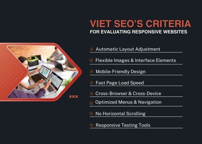
Criteria for Evaluating a Responsive Website
A website is not truly responsive merely because its homepage fits on a phone. Important page templates and complete user journeys should be evaluated.
1. Content Reflows Correctly
- Columns stack or resize when space becomes limited.
- Text and controls do not overlap.
- No important content is cut off.
- The page does not require horizontal scrolling during normal use.
2. Text Remains Readable
- Visitors do not need to zoom to read ordinary text.
- Line lengths remain comfortable.
- Headings do not occupy the entire mobile viewport unnecessarily.
- Text can be enlarged without breaking the page.
3. Images and Video Adapt
- Media remains within its container.
- Images are not distorted.
- Appropriate image sizes are delivered.
- Important image content is not removed by poor cropping.
4. Navigation Remains Usable
- The menu can be opened, navigated, and closed easily.
- Important destinations are not hidden unnecessarily.
- Keyboard and assistive-technology users can operate it.
- Dropdowns do not depend only on hover.
5. Buttons and Links Support Touch
- Controls are large enough to activate.
- Interactive elements are not crowded together.
- Buttons provide visual feedback.
- Sticky elements do not block other controls.
6. Forms Work on Small Screens
- Fields fit within the viewport.
- Labels remain visible.
- The correct mobile keyboard is displayed.
- Errors are clear and easy to correct.
- The submit button remains accessible.
7. Performance Remains Acceptable
- Pages load reasonably on mobile connections.
- The primary content is not delayed by unnecessary scripts.
- Images are appropriately sized.
- The interface responds promptly to interaction.
- Content does not shift unexpectedly while loading.
8. Important Content Is Consistent
- Mobile visitors receive the same essential information as desktop visitors.
- Important links and calls to action remain available.
- Metadata and structured data remain consistent.
9. The Website Works in Different Orientations
- The interface works in portrait and landscape modes.
- Important controls remain visible when the viewport height is limited.
- The design does not rely on a fixed screen height.
10. The Website Supports Different Input Methods
- Mouse input works.
- Touch input works.
- Keyboard navigation works.
- Interfaces do not depend exclusively on hover.
How to Test Responsive Web Design
Use Browser Responsive Design Tools
Chrome, Firefox, Safari, and Edge include tools for simulating various viewport dimensions and device characteristics.
These tools are useful for quickly testing:
- Viewport widths.
- Touch simulation.
- Device pixel ratio.
- Network throttling.
- Portrait and landscape orientation.
Do not test only the preset device list. Drag the viewport gradually through different widths to identify points where the layout begins to fail.
Test on Real Devices
Browser simulation cannot reproduce every aspect of a physical device.
Real-device testing can reveal problems involving:
- Mobile browser toolbars.
- On-screen keyboards.
- Touch behavior.
- Font rendering.
- Device performance.
- Camera and file uploads.
- Actual network conditions.
Use Cross-Browser Testing
Test the website on the browser and operating-system combinations used by the target audience.
At minimum, consider representative versions of:
- Google Chrome.
- Safari.
- Firefox.
- Microsoft Edge.
- Mobile Safari.
- Chrome on Android.
Test Complete User Journeys
Do not test only individual pages. Complete common tasks such as:
- Opening the navigation.
- Searching the website.
- Submitting a contact form.
- Creating an account.
- Adding a product to the cart.
- Completing checkout.
- Uploading a file.
- Using filters.
- Watching a video.
Use Performance Testing Tools
Useful tools include:
- Google PageSpeed Insights.
- Lighthouse.
- Chrome DevTools.
- WebPageTest.
- GTmetrix.
- Real-user monitoring.
Google’s former Mobile-Friendly Test is no longer available. Browser testing, Lighthouse, PageSpeed Insights, Search Console, accessibility testing, and real-device review now provide a more complete evaluation.
Common Responsive Design Mistakes
Using Device-Specific Breakpoints Only
Designing only for several named phone or tablet models can leave gaps between those dimensions. Choose breakpoints based on the content and layout.
Hiding Important Mobile Content
Removing useful text, links, or features creates an incomplete mobile experience and may weaken search visibility.
Making Everything Full Width
Full-width controls can work well on mobile, but not every component needs to stretch across the screen. Excessively wide text fields and buttons may reduce clarity on larger devices.
Using Tiny Fixed Font Sizes
Text should remain comfortable to read across devices and when users enlarge it.
Depending on Hover
Touchscreens do not have a reliable hover state. Essential content and controls should remain available without it.
Ignoring Landscape Mode
Limited viewport height can cause sticky headers, cookie notices, and dialogs to cover most of the page in landscape orientation.
Loading Desktop Assets on Mobile
Hiding a large image or video does not necessarily prevent its download. Use responsive resource-loading techniques.
Reordering Content Visually Only
CSS can make content appear in a different order from the HTML source, creating confusion for keyboard and screen-reader users.
Testing Only the Homepage
Article pages, product pages, forms, tables, checkout, account areas, and error messages may each have different responsive problems.
Responsive Website Checklist
Layout and Content
- The viewport meta tag is present.
- The layout adapts continuously across widths.
- No important element overflows its container.
- Horizontal scrolling is not required during normal use.
- Text remains readable and can be enlarged.
- The mobile experience contains all essential content.
Navigation and Interaction
- The menu works with touch and keyboard input.
- Important links remain available.
- Buttons are clearly labeled.
- Touch targets have adequate size and spacing.
- Interfaces do not depend only on hover.
- Focus states remain visible.
Images and Media
- Images remain within their containers.
- Responsive image sources are configured where useful.
- Image dimensions are defined.
- Video and embedded media scale correctly.
- Important media includes suitable alternative text or captions.
Forms
- Every field has a visible label.
- Fields use appropriate input types.
- Errors are easy to identify and correct.
- The mobile keyboard does not hide critical controls.
- Entered information is preserved after validation.
Performance
- Mobile devices do not download unnecessarily large images.
- Critical content loads promptly.
- JavaScript work is controlled.
- Third-party scripts are reviewed.
- Core Web Vitals are monitored.
- Performance has been tested under slower network conditions.
Testing
- Multiple viewport widths have been tested.
- Portrait and landscape modes work.
- Representative physical devices have been tested.
- Supported browsers have been reviewed.
- Keyboard and accessibility tests have been completed.
- Complete user journeys have been tested.
Frequently Asked Questions
What Does Responsive Web Design Mean?
Responsive web design means creating layouts and components that adapt to the available viewport, container size, device characteristics, and user preferences.
Is Responsive Design the Same as Mobile Design?
No. Mobile design focuses specifically on mobile conditions. Responsive design aims to support a broad range of screen sizes and environments, including mobile, tablet, laptop, and desktop displays.
Does Responsive Design Require JavaScript?
No. Core responsive layouts can be built with HTML and CSS. JavaScript may enhance particular interactions, but it should not be required merely to make basic content fit the screen.
Does Responsive Design Help SEO?
Responsive design can support SEO by keeping content, URLs, links, metadata, and structured data consistent across devices. However, it does not guarantee rankings or replace content quality and broader technical SEO.
What Is Mobile-First Design?
Mobile-first design begins with essential content and functionality for narrow screens, then progressively enhances the interface as more space becomes available.
How Many Responsive Breakpoints Should a Website Have?
There is no required number. Add breakpoints where the content or layout needs to change, rather than trying to match every device category.
What Is the Best Responsive Screen Size?
There is no single best screen size. The website should remain usable across a continuous range of widths and heights.
How Can I Check Whether My Website Is Responsive?
Resize the browser, use browser responsive-design tools, test real devices, inspect important page templates, complete major user journeys, and run performance and accessibility tests.
Why Does My Responsive Website Have Horizontal Scrolling?
Common causes include fixed-width elements, oversized images, long unbroken text, wide tables, translated content, absolute positioning, or margins that extend beyond the viewport.
Should Mobile and Desktop Pages Have the Same Content?
They should provide the same essential content, functionality, metadata, and search signals. The order or presentation may change to suit the available space.
Is a Hamburger Menu Required on Mobile?
No. It is one possible navigation pattern. The best choice depends on the number and importance of menu items and the needs of the target audience.
Can an Existing Website Be Made Responsive?
Yes, but the amount of work depends on its code, content structure, templates, plugins, and interface complexity. Some websites can be improved through CSS changes, while others require a broader redesign.
Conclusion
Responsive web design is a fundamental requirement for modern websites. It helps content, navigation, forms, images, and interface components remain useful across different screens and input methods.
An effective responsive website should:
- Use flexible layouts and content-based breakpoints.
- Maintain essential content across devices.
- Provide readable typography.
- Support touch, mouse, and keyboard input.
- Deliver appropriately sized images and media.
- Keep forms and navigation easy to use.
- Support accessibility preferences.
- Load efficiently on mobile connections.
- Be tested on real devices and browsers.
Responsive design should be treated as an ongoing quality requirement rather than a one-time task. New content, plugins, advertisements, forms, and interface components can introduce layout problems after launch.
Businesses should regularly test important templates and user journeys, monitor real-user performance, and fix common web design mistakes that reduce usability, accessibility, or website performance.
VietSEO provides responsive website design, mobile UX optimization, technical SEO, accessibility improvement, performance optimization, and cross-device testing services for business websites, ecommerce stores, and custom web applications.



Questions & Comments
You can ask a question about this article. Viet SEO will review and reply after moderation.